
Shokudo Maeno
- Client
- Shokudo Maeno
- Scope
- Brand Strategy · Brand Identity · Illustration · Menu Design
- Year
- 2025
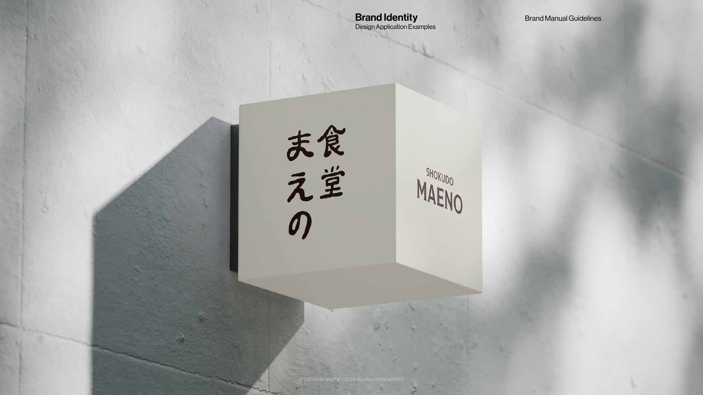
Taraba crab, Wagyu, uni and maguro, flown in from Japan and served without ceremony: this is Japanese home-style cooking with an uncompromising approach to flavour, at Shokudo Maeno, a chef-owned casual dining spot in Bangkok. The brand had to hold two things at once, seriousness about ingredients and the ease of a neighbourhood kitchen. Verywhere's brand strategy and visual identity answer by drawing on Ikebana and Wabi-sabi: liveliness, harmony and the beauty of imperfection, expressed through brushstroke logotypes and hand-drawn illustration.
The strategy drew on two archetypes, the Everyman and the Entertainer: relatable, warm, a little playful, never formal. Every visual decision follows from that. The Japanese logotype is written in a soft, irregular brush hand so the name feels made by a person rather than set by a machine, while the English wordmark in Modesto Text keeps the premium promise legible to Bangkok diners. A deep burgundy anchors the palette, with mustard, linen and warm browns giving each touchpoint room to shift in tone. Ink illustrations of the signature ingredients, Taraba, maguro, uni and Wagyu, along with sake cups and teapots, act as the brand's second voice: they carry humour and craft onto the menus and into the room, from the maguro on the fabric partition to the hand-drawn restroom pictograms, without the logo having to do all the work.
Applications were designed to feel handled rather than printed. The table carries most of the identity: everything on it shares the same two or three colours, so a setting reads as the brand before anyone notices a logo. Inside the building one hand-drawn line runs from the brush logotype on the signage to the restroom pictograms, and the menus alternate ink illustration with ingredient photography so the produce makes the premium case on its own.