
Not a Matcha
- Client
- Not a Matcha
- Scope
- Brand Strategy · Brand Identity · Packaging Design · Menu Design
- Year
- 2025
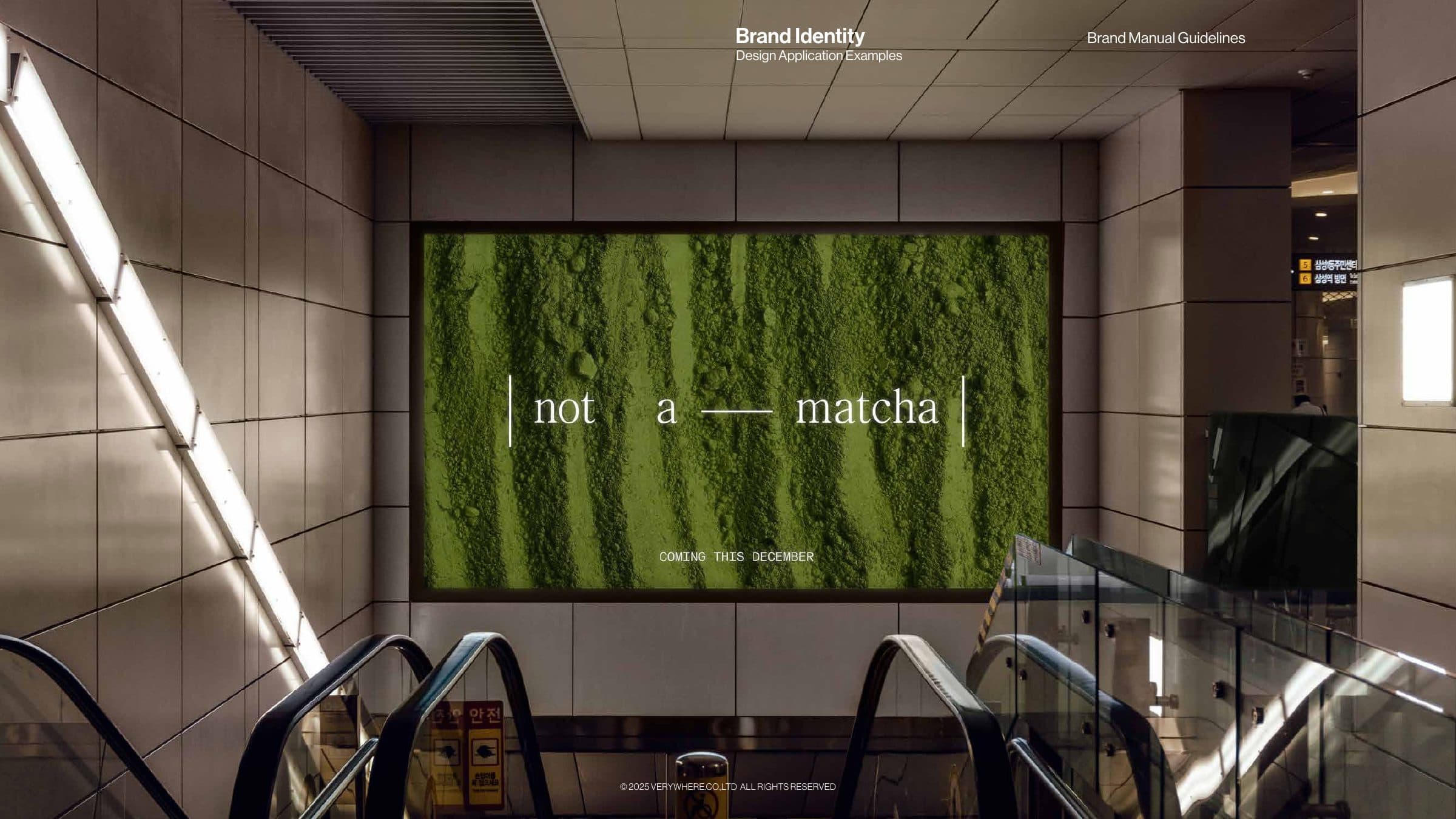
In mathematics, absolute value brackets turn a negative into a neutral, so |not a matcha| is, in fact, matcha. That is the idea the name supplied to a Bangkok matcha brand that treats ceremonial-grade tea as a modern ritual rather than a heritage product: the notation became the logotype and set the tone for an identity built on mathematical structure and lab precision. Verywhere took the brand strategy and visual identity from there and carried them through to the cafe itself, from what leaves the counter to what hangs on the wall.
The strategy positions Not a Matcha as a fashionable beverage, bold and minimal, for a generation that values design as much as wellness. The identity answers with a scientific aesthetic. The logotype sits inside absolute value bars, a quiet serif wordmark held by a piece of notation. Red, labelled in the concept as the colour of an error or invalid input, leads the palette, with the greens of matcha and leaf kept as secondary tones alongside burgundy and pale blue. Forma DJR Mono carries the lab voice, paired with FC Mahanakorn for Thai, and square brackets mark small details and menu numbering. A 25 by 25 grid and a single dotted red line organise every layout, guiding the eye straight or diagonally across menus, posters and screens so each touchpoint feels calculated in the same way.
Applications were kept deliberately spare so the notation could do the work. Packaging carries nothing but the wordmark, set vertically on the can so the name reads like a value on an axis, and the same restraint holds on bags and carriers. Print relies on the grid and the dotted line as its only decoration, while the campaign visual lets matcha texture fill the frame beneath the logotype, so the brand reads identically in hand, on the wall and on the phone.