Luma Hotel Hatyai
- Client
- Luma Hotel
- Scope
- Brand Strategy · Brand Identity · Art Direction
- Year
- 2025
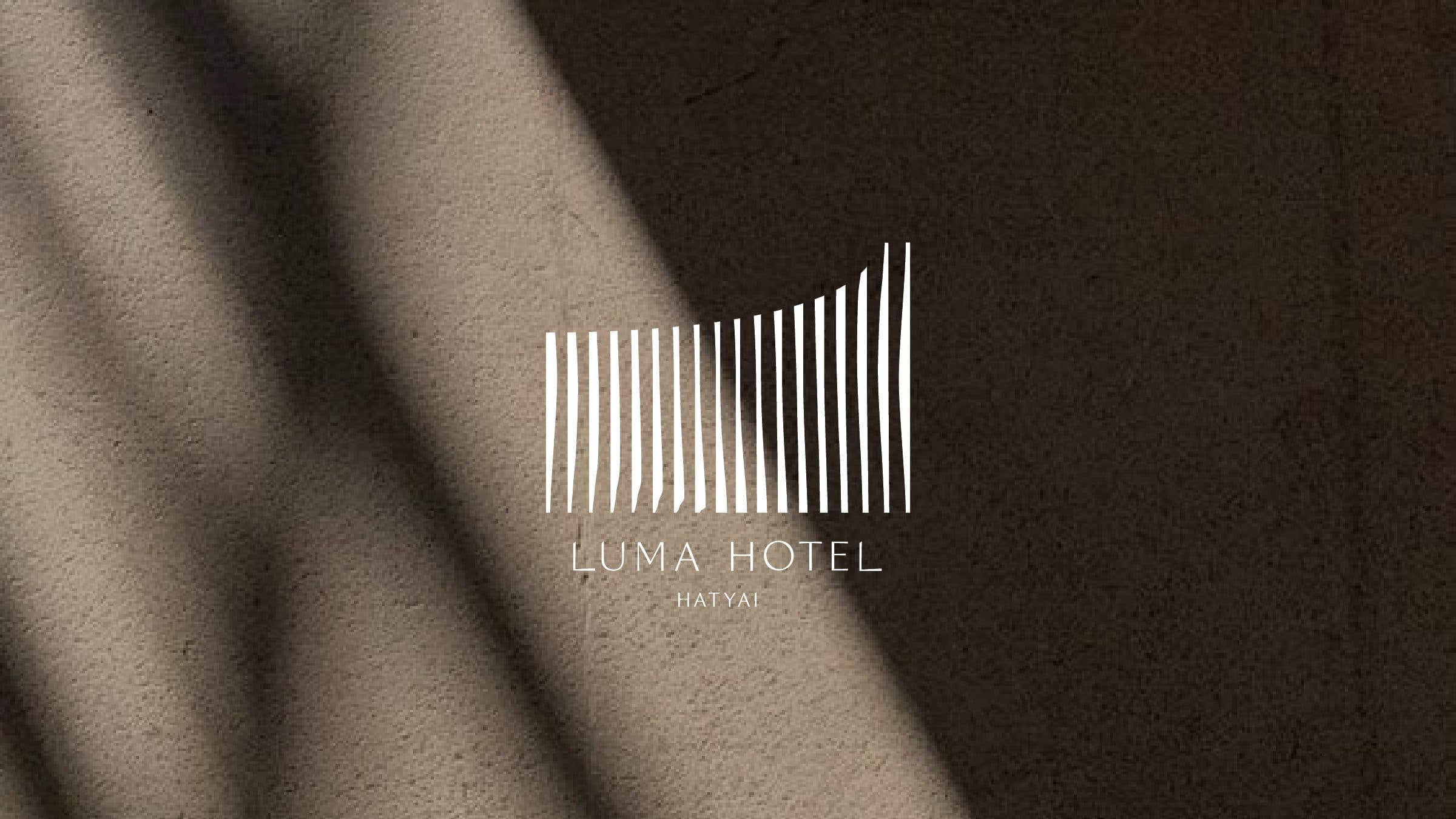
Yugen, the Japanese aesthetic idea of a subtle beauty that surfaces in everyday moments and resists description, gives Luma Hotel its spirit: sunlight through branches, ripples left by a passing fish. From that philosophy Verywhere shaped the brand strategy and visual identity for a hotel in the centre of Hat Yai, positioning it as a sanctuary of warmth, a soft light in the city. The identity is drawn from the building itself: its lattice facade, and the shifting shadows that light casts through it, became the mark, the pattern and the mood of every touchpoint.
The lattice facade gave the identity its logic. Verywhere translated the panels into a mark of slender vertical strokes that lift at one end, as if a screen were catching the light, so the symbol reads as architecture and as shadow at the same time. The same rhythm expands into a full pattern laid over photographs of leaf shadows, and contracts into a family of wayfinding pictograms, keeping the whole system in one visual language. Colour stays deliberately quiet: greige, soft greige and light gray carry the tone, with pistachio, dark olive and graphite for depth, so nothing competes with natural light in the space. Cairo gives headlines a fine, elongated voice, DM Sans and IBM Plex Sans Thai keep information calm and legible, and the imagery direction asks for warmth, softness and airiness rather than saturation.
Across the guest journey the mark is applied with restraint. It sits small on the pieces a guest handles, from key card holder to bathrobe, and stretches into a full width stripe on the aroma diffuser box, so the pattern speaks where a logo would be too loud. Social media templates set Cairo headlines over warm interiors under the line Stay in Soft, carrying the hotel's promise of quiet light from the building to the feed.