Icraft
- Client
- Icraft
- Scope
- Brand Identity · Illustration · Packaging Design · Art Direction
- Year
- 2025
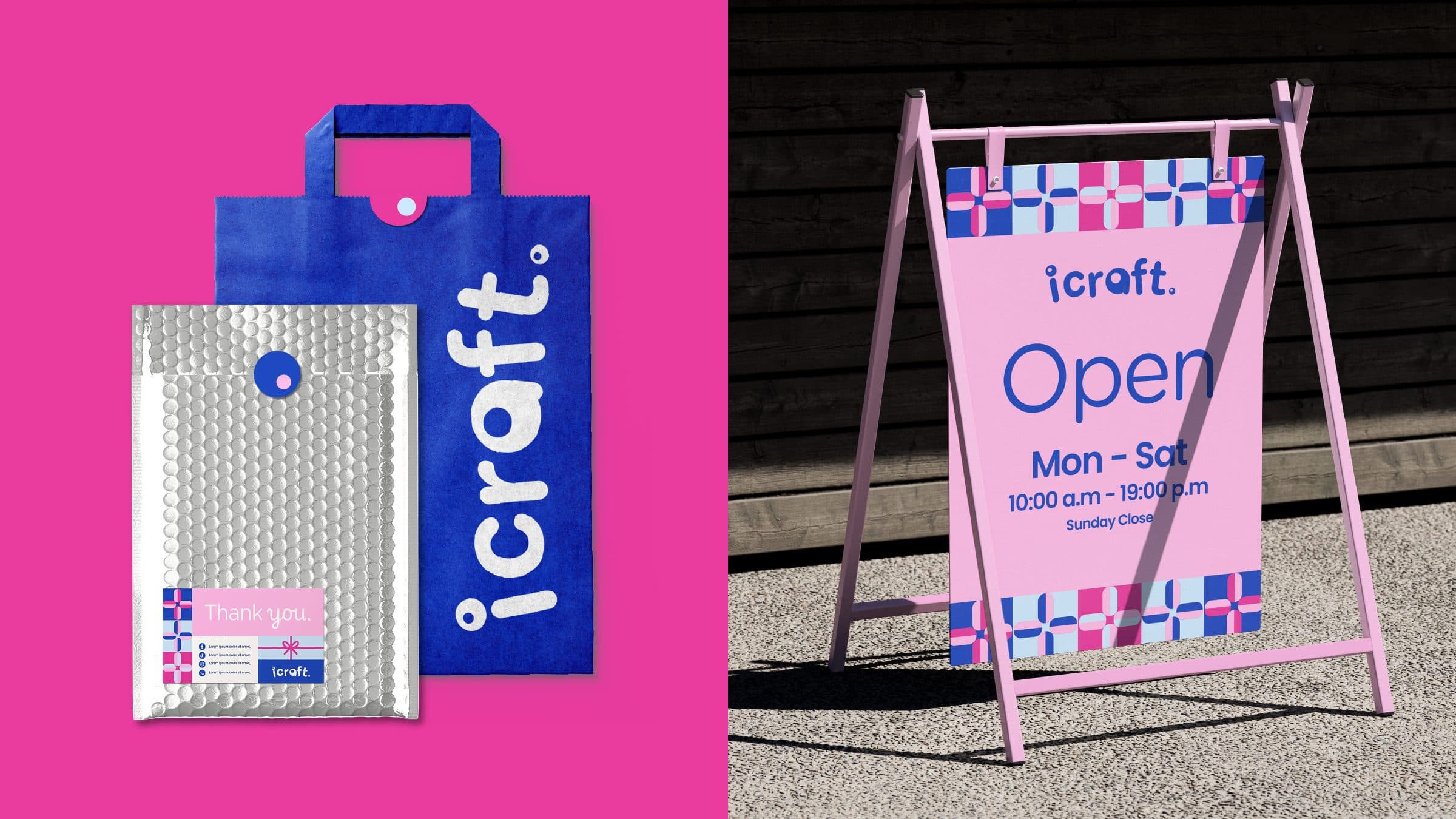
Icraft sells the raw material of making: beads, clasps, pliers, thread, the small components a hobbyist turns into something of their own. Verywhere made that exchange the heart of the brand identity, captured in the line Your Craft Your Story. A rounded lowercase wordmark, in which a ring-shaped bead forms the dot of the i and the closing full stop, sets a friendly tone, while a palette of Sky Blue and Pink Pastel keeps the brand bright and approachable. Set in both Thai and English, the system follows the products from the shop floor to the screen.
The central idea is that the tools and materials of craft are the brand. Pliers, spools, chains, scissors, calipers, beads and clasps were redrawn as a flat illustrated vocabulary in the brand colours, then set into coloured rectangular frames so they can tile into patterns of any proportion. This gives Icraft a graphic language that can carry a whole surface, a border or a single sticker, and it works on its own or alongside product photography. Typography follows the same logic: Gotham Rounded for headlines and Poppins for body text share the soft geometry of the wordmark, and a script face, Playwrite, adds a handmade emphasis where the message turns personal. A parallel Thai set in Prompt keeps the bilingual system consistent, so the brand speaks the same way in either language.
Across applications the illustrated elements do most of the work, filling whatever surface will hold them, from the border of the pavement sign to the back of a tee, while the wordmark is scaled to its object: large on the carrier bag, small on the mailer and tee. Photography of beads and thread, shot bright on white, gives the workshop and promotion templates a real product presence, and solid colour fields anchor every piece so Icraft reads the same on a shelf, a shopfront and a phone screen.