
Ha-Roy
- Client
- Ha-Roy
- Scope
- Brand Identity · Mascot Design · Packaging Design · Illustration · Art Direction
- Year
- 2025
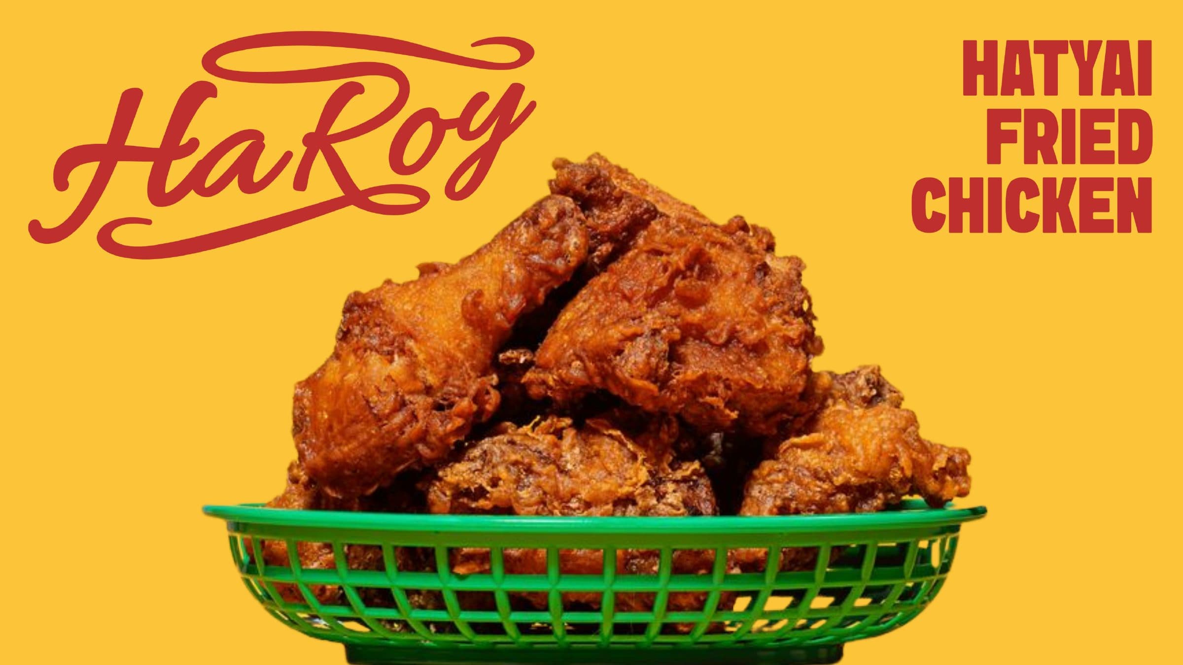
The name Ha-Roy comes from the Southern Thai exclamation for a sigh, and it now belongs to a Hat Yai fried chicken brand. Verywhere shaped an identity that keeps that dialect energy audible: a red hand-lettered script on a warm yellow ground, a mermaid riding a rooster as the brand character, and a food-first photographic language built on colour-blocked backdrops. The result is a brand that feels rooted in the lively, colourful character of the South while working with the clarity of a modern quick-service chain across packaging, social media and delivery platforms.
Four words guided the system: dynamic, movement, nostalgia, vibrant. The logotype is drawn as a flowing script with long connecting strokes, so the name reads as a spoken exclamation rather than a static label, and it exists in both Thai and English forms so the two can trade places without losing rhythm. The character brings the coastal South into the picture: a mermaid astride a rooster, extended into a small cast that surfs and sings, giving the brand a storyteller's range beyond a single icon. Yellow carries about sixty percent of the palette so every touchpoint reads instantly as Ha-Roy, with red for the logotype and headlines, teal as a cooling counterpoint, and a bold display face paired with Prompt for Thai and English copy. Everything in the system is built to be loud and warm at the same time.
Photography does much of the brand's talking. Product is shot against flat fields of brand yellow and red, or cut out on clean white, with expressive close-ups of a bite or a glaze drip that make appetite the message. The character and script wrap the printed cones, cups and chicken boxes, and social posts set large Thai and English headlines straight over the food, so a delivery-platform promotion and a takeaway box speak the same language.