Ceres
- Client
- Ceres
- Scope
- Brand Identity · Packaging Design · Menu Design · Art Direction
- Year
- 2026
Healthy drinks do not have to be calm and minimal; they can be vibrant, confident and full of life. That is how the Ceres brand book sets out the position of a smoothie and cold pressed juice brand that wanted to take health somewhere louder. Verywhere built the identity around a single act, blending. The wordmark fuses its letterforms into one continuous shape, the way ingredients fold into one smooth drink, and a knotted symbol carries the same idea wherever the full name cannot fit.
Everything in the system follows from that one gesture of mixing. The palette pairs a soft lavender with an acid yellow, then adds deep berry, vivid purple and lime so the drinks themselves set the range of the brand rather than a neutral backdrop. Line Seed Sans in its heaviest weight carries headlines in both Thai and English, chunky enough to sit beside the wordmark without competing with it. Short word pills, purely, smooth, good, nutrition, fuel, act as a second voice that can be scattered across packaging and posts, and a repeat pattern of the symbol and wordmark gives the bandana, and future textiles, something to wear. Photography leans on movement and appetite: runners, wet fruit, bowls piled high, so the brand reads as energy you can drink rather than a wellness ritual.
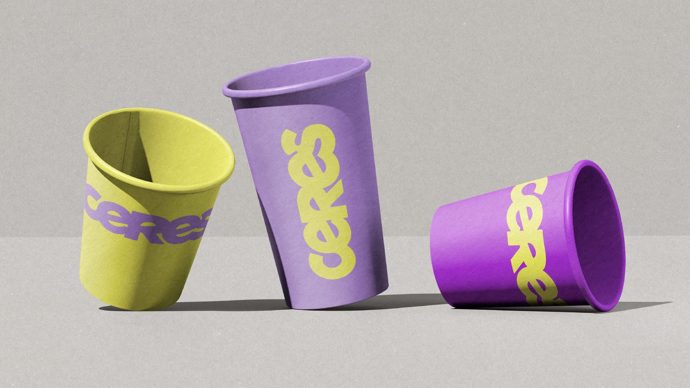
Print and packaging keep the idea physical. The wordmark runs large and vertical around cups and bottles so its fused letterforms become the pack graphic itself, while lid stickers and bottle sleeves carry the symbol alone where the drink should stay the hero. Merchandise repeats the colour blocks and the pattern rather than adding new devices, and the social templates show the imagery and word pills working together at phone scale, so the brand behaves the same way in hand and on screen.