
Attas
- Client
- Attas
- Scope
- Brand Strategy · Brand Identity · Packaging Design · Art Direction
- Year
- 2026
Attas is a personal care brand formulated for the tropics. Its founder came home to Bangkok after a decade in Boston, Dublin and New York and found that products designed for cold climates failed in the heat, while local options were heavy on chemicals. Verywhere built the brand strategy and visual identity around one fact: Bangkok sits at Latitude 14°. That line and its degree symbol became the logotype, the 14° mark and a graphic system that carries the brand from packaging to digital on a restrained black and white base with a sparing red accent.
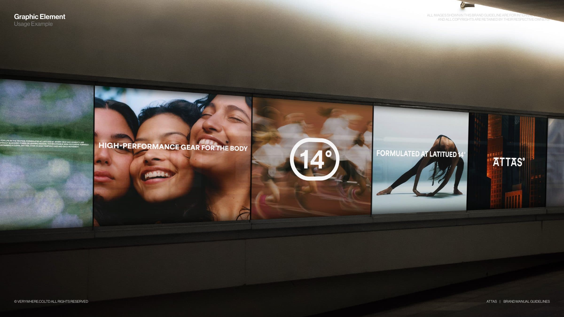
The concept treats the tropical climate as a living constraint rather than a marketing angle. Latitude 14° gives the identity a literal anchor: a horizontal line sits above the brand name, the degree symbol closes the logotype, and the 14° mark stands alone inside a rounded frame. That frame then does more work than a symbol usually does. It becomes an image frame with a blurred surround, a segmented strip of connected boxes that hold words or cropped photography, and a red Latitude line on which headlines and taglines rest. Typography stays deliberately standard and structural so imagery of sweat, motion and heat can lead. Black and white form the base, grey supports, and Attas Red is used sparingly as a quiet signal of confidence. Packaging is the single exception, where each product variant carries its own pastel so it can be told apart on shelf.
Applications were chosen to test the system at every scale. The lightbox strip carries the photography, the mark and the headline line at architectural size, while a bus shelter poster, social templates and a phone feed show the same few elements holding together inside a single frame. Packaging keeps the logotype and 14° mark tone on tone and quiet so the variant colours do the shelf work, and a canvas tote reduces the brand to the logotype alone.