Hatch by Haab
- Client
- Haab
- Scope
- Brand Strategy · Brand Identity · Packaging Design · Art Direction
- Year
- 2025
Hatch by Haab takes a humble egg cake and reintroduces it as a modern, international dessert. Its parent, Haab, is a dessert brand from Songkhla that reworks southern Thai recipes for everyday life. Working from the original cake's egg shape, Verywhere gave the strategy, identity and packaging one idea: hatching as rebirth and transformation. The name, the wordmark and the packaging all describe a shell cracking open to reveal something new, so a familiar local sweet can sit alongside premium patisserie without leaning on nostalgia.
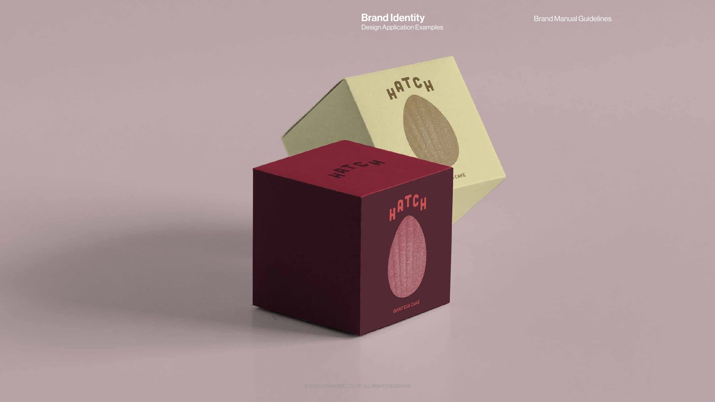
The strategy set a deliberate distance from the parent brand. Where Haab is warm, regional and affordable, Hatch had to be culturally neutral and globally fluent, presenting the egg cake as a sculptural object rather than a traditional delicacy. The wordmark carries this: its letters curve along the contour of an egg, pairing bold geometry with softness so the mark reads as modern and premium. Colour does the emotional work, with deep burgundy and crimson at the core and blush pink and yolk gold as accents, colours that echo the cake's own crust and yolk tones. Instead of literal product shots, the graphic system uses duotone close-ups of cake textures and ingredients, abstract fragments that invite a closer look and give every touchpoint a shared surface to draw from.
Packaging turns the concept into an object. The giant egg cake box carries an egg-shaped panel filled with the duotone cake texture, produced in a burgundy and crimson version and a butter yellow and brown version so one structure can shift with campaigns. Across bags, print, social and merchandise the wordmark and palette are applied with restraint, so the product photography carries the appetite appeal.