
Blacken
- Client
- Blacken
- Scope
- Brand Identity · Mascot Design · Packaging Design · Menu Design · Art Direction
- Year
- 2025
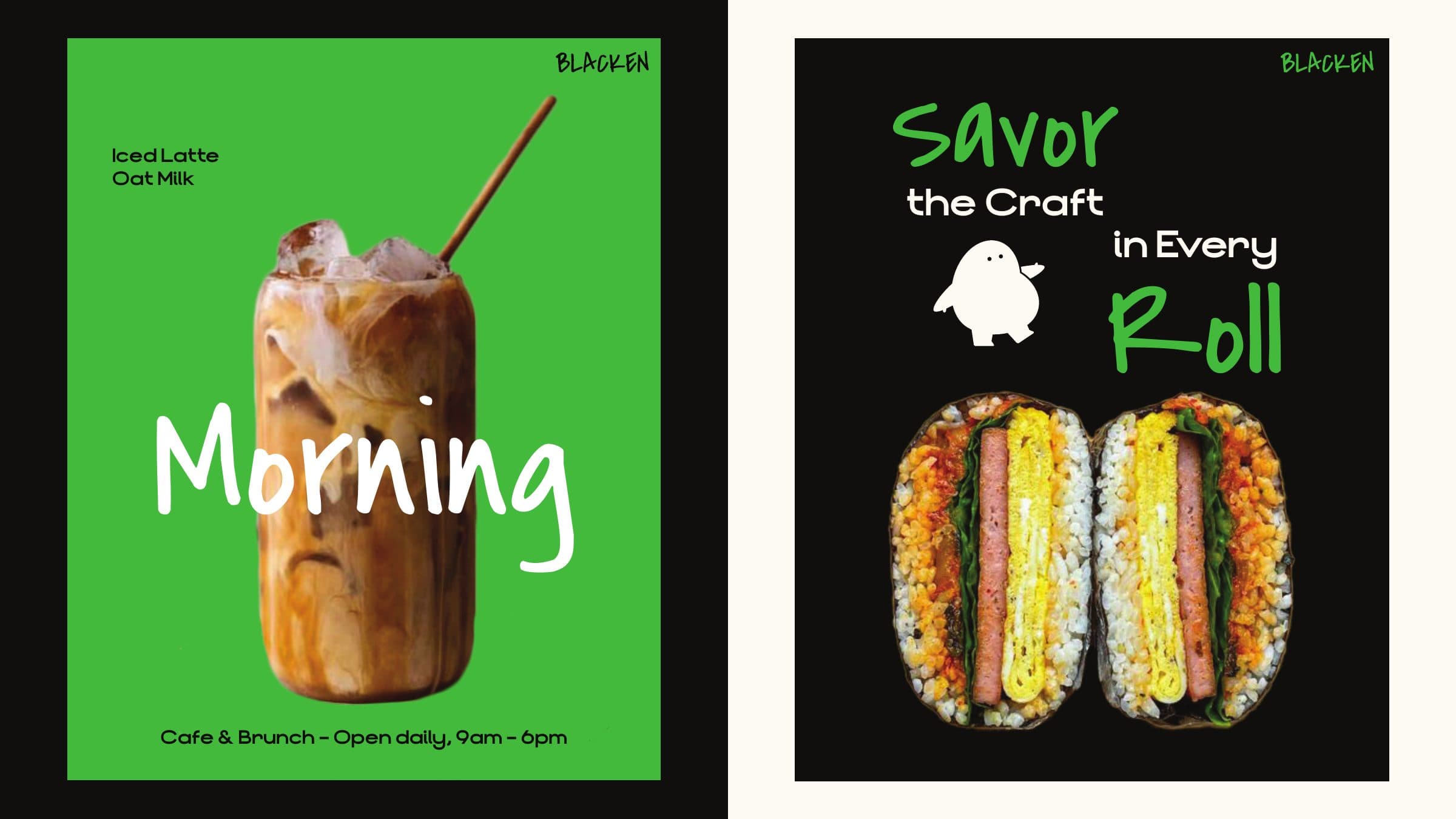
Everything about Blacken, a cafe and brunch concept, starts with its space, a dark, monolithic room of granite and concrete. Verywhere gave the name a personality to push against that darkness: a round, wide-eyed character with a hand-drawn logotype, set in near black and a single sharp green. Rather than soften the room, the identity keeps it and lets the small figure supply the warmth, so the brand reads as quietly confident from the street and playful the moment you get close, on a cup, a menu or a paper bag.
The system runs on contrast. Black carries the name and the architecture; green is used sparingly as the signal colour, so a single cup or menu card can flag the brand from across a room. The character is the graphic element itself: instead of a pattern or a set of icons, a family of poses lets the same figure wave from a sign, slump on a takeaway box or tumble across a bag, which keeps every touchpoint recognisable without repeating the full logo. Type follows the same logic. A loose marker script handles the name and the headlines, while a clean geometric sans and a matched Thai face carry prices, hours and descriptions, so the informal voice never gets in the way of information.
Execution stayed consistent across scale, from a coaster to a shopfront sign, because the character is the same figure everywhere rather than a redrawn mark. Green is rationed to one flag colour per touchpoint, so a single cup, poster or cap can announce the brand without repeating the full logo. That discipline is what lets a steel A-frame and one printed cup carry the identity as convincingly as the packaging system does.