
The Gate Café
- Client
- The Gate Café
- Scope
- Brand Identity · Packaging Design · Illustration
- Year
- 2024
The identity for The Gate Café, a coffee house, needed to feel sophisticated, modern and welcoming at once. Verywhere anchored the brand in a refined serif wordmark and a warm palette of light cream, curry gold, bracken brown and phthalo green, then carried it from the counter to the social feed. The core idea is reduction: everyday cafe objects simplified into flat cut-out silhouettes, so the brand is recognisable from a single leaf or bean. The resulting family of illustrations brings coffee, fruit and tableware into packaging and social content.
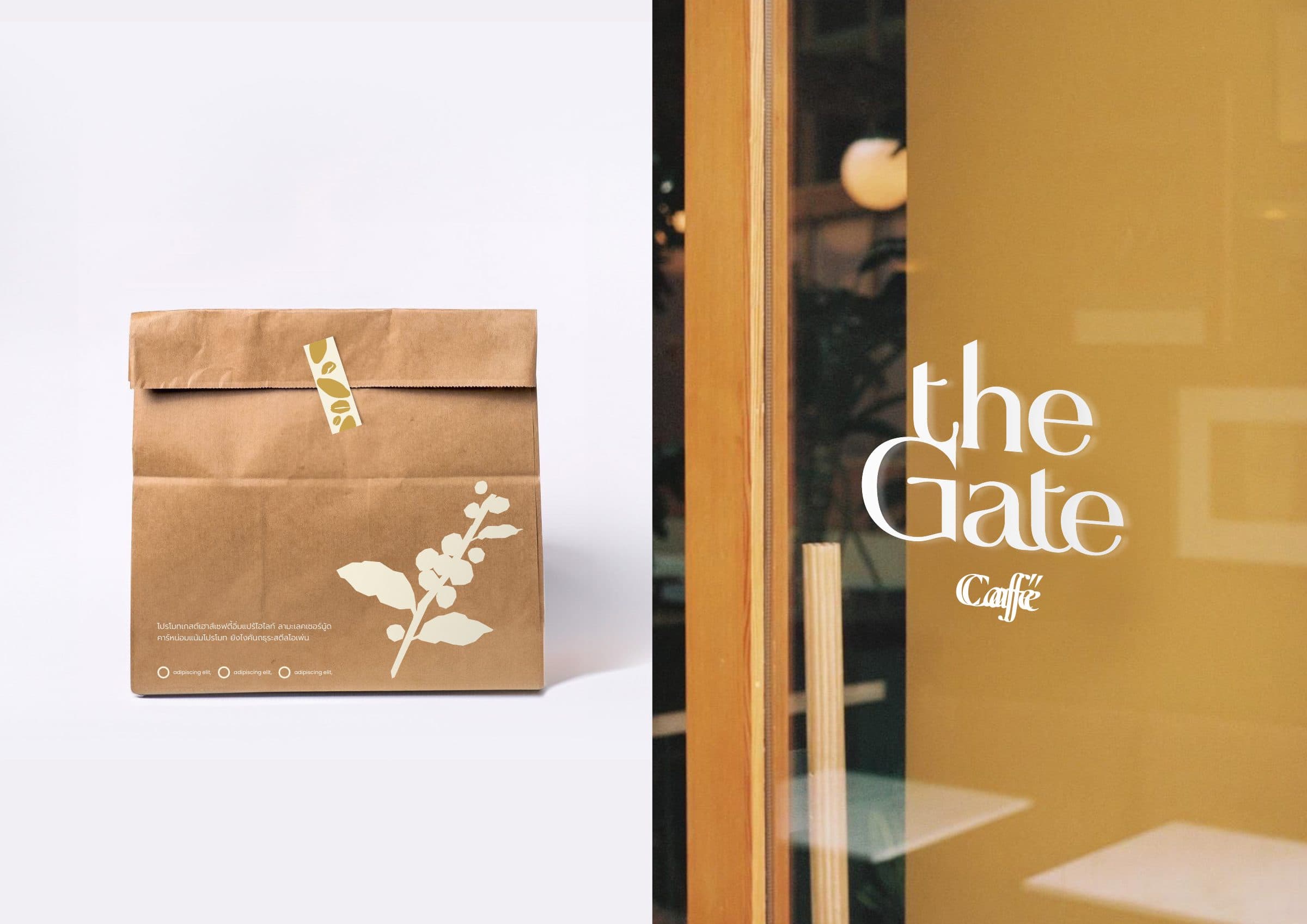
The wordmark carries the tone: a serif with sharp, tapered strokes, set on one line or stacked on two, with Café as an italic signature beneath. Around it sits a palette of two grounds, light cream and curry, anchored by bracken brown and phthalo green, plus four brighter accents that appear in illustration and social content, so the system stays calm and can still surprise. EB Garamond and Poppins handle English, Prompt handles Thai, so Thai and English content share one voice. The graphic language follows the same principle: coffee beans, leaves, cups, glasses and fruit, drawn as flat cut-out shapes, work as a pattern on a cup carrier, as a single motif on a bag, or as an illustration on a post. Social templates set a rhythm of educational content, product photography and story-telling graphics across the feed.
On physical pieces the system is kept deliberately sparse. The wordmark sits alone on the apron, plate and pin, and with nothing but opening hours on the A-frame, so colour and material do the talking, while the cut-out motifs go where there is surface to fill: a bean pattern on the cup carrier and packing tape, a single coffee branch on the kraft bag. Coasters and cards are die-cut in the shape of a bean, so the illustration becomes the object itself.