
Horizon by Patta
- Client
- Patta Development
- Scope
- Brand Strategy · Brand Identity · Illustration · Art Direction
- Year
- 2024
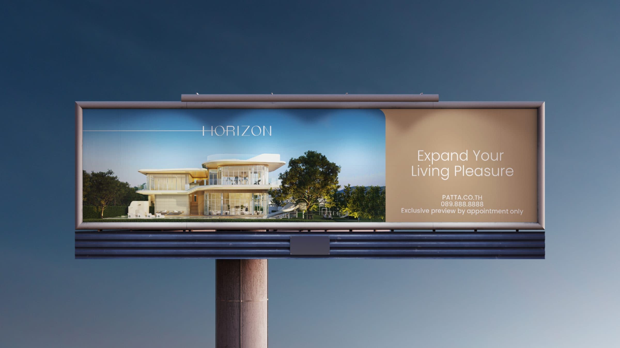
Patta Development positions Horizon, its residential community, as a serene hideaway that stays within reach of the city. One gesture had to hold the brand's character on a business card, a billboard and the entrance gate alike, and Verywhere found it in the horizon line itself: a single thin rule that runs through the H of the logotype and extends across layouts, signage and imagery, standing for the calm outlook the community promises and the forward-looking spirit of its developer.
The logotype is drawn in light, extended capitals so the horizontal stroke can leave the H and travel outward, which lets the same mark sit quietly at card size or stretch across a whole surface without changing character. The palette pairs a warm sand, named Bernard Beach in the guidelines, with a deep Warm Blue, joined by a soft pink and a beige, so the identity reads as sunlit and grounded rather than corporate. Poppins carries the English and Aktiv Grotesk Thai the Thai script, chosen so both feel equally light. Fine white line drawings of the clubhouse and landscape, and a matching set of amenity and security icons, give the developer a way to explain facilities in the same delicate hand, so every touchpoint speaks with one voice.
Across the applications the line does the work of the brand, since one thin rule holds at any scale: it runs out of the H on a business card, stretches across a brochure cover and crosses the sky above the clubhouse renders. The smaller pieces are reduced further, so the site helmet and drawing tube take the logotype alone, while the billboard gathers render, headline and palette into one uncluttered announcement.