
Locals.hdy
- Client
- Locals.hdy
- Scope
- Brand Strategy · Brand Identity · Menu Design · Art Direction
- Year
- 2020
Hat Yai and Songkhla themselves became the subject of Locals.hdy, a southern Thai dining and specialty coffee spot in Hat Yai conceived as a community identity for the people who live there. Verywhere developed the brand strategy and visual identity from a single premise, Explore the Local Identities: the landmarks, textiles and everyday tableware of the region supply the material of the brand, so the cafe reads as a place made by locals rather than a concept imported from elsewhere.
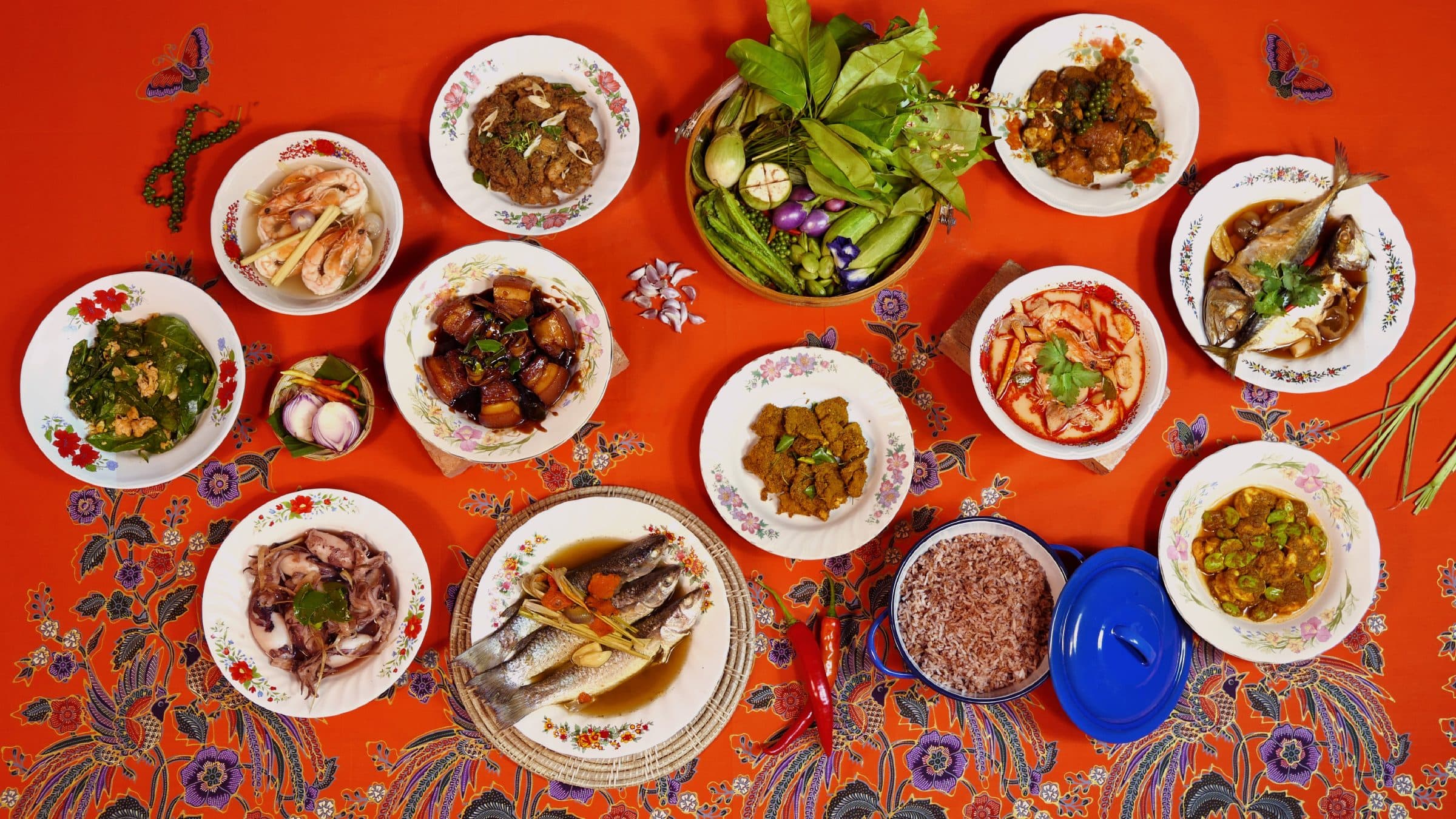
The palette takes its cue from red brick and clay, warm earth tones that the cafe's brick facade carries at full scale. A light serif wordmark in English is paired with custom Thai lettering, so the brand speaks to residents and visitors in one voice, and hdy, the shorthand for Hat Yai, ties the name to its town. The key visual gathers the Hat Yai Junction sign, the clock tower, shophouses, the train and archival photographs into a single collage: a compact portrait of the city that sits behind the menu. Letterforms from the wordmark are repeated into a pattern, giving the system texture without introducing any new symbol. Photography follows the same logic, styling southern dishes on batik cloth, floral enamel plates and terracotta tile so the local cues run from page to plate.
On the menu the collage recedes to a faint tint behind the dishes, so the food photography leads while the city stays present. The wordmark is applied as dimensional lettering across the brick facade, where the clay colour of the palette becomes an actual material. Seasonal communications produced years later, including the 2026 Mayongchid campaign, still sit comfortably inside the same palette and the Locals hdy wordmark, which is the real test of a system designed to be lived in.