
Langhoi Tienlao
- Client
- Langhoi Tienlao (หลังห้อยเทียนเหลา)
- Scope
- Brand Identity · Illustration · Packaging Design
- Year
- 2023
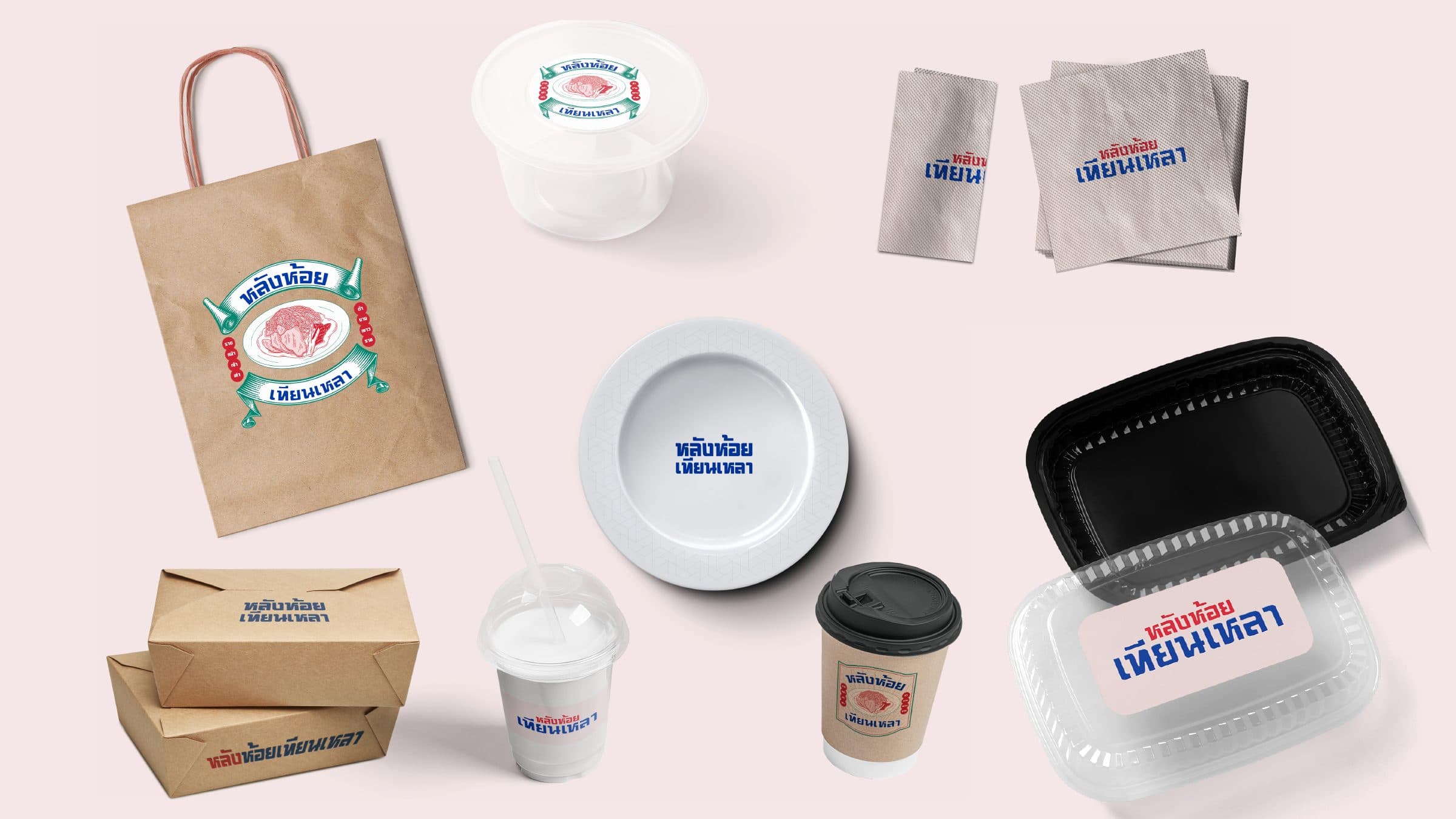
Rad na, noodles under a thick gravy, is found everywhere in Thailand from street carts to food courts, and Langhoi Tienlao is a restaurant that serves it. Verywhere created the identity and its guideline with one aim: a brand that stays true to the shop's spirit, which the guideline names as joyful, easygoing and old fashioned. That spirit became a bold two colour Thai logotype on soft pink, a ribboned emblem crowning the signature plate, and a family of line illustrations drawn from the life of the shop.
Every element is built to hold those three words at once. The logotype uses a heavy, squared Thai letterform, with one typeface serving both Thai and English, so the name reads like a painted shop sign rather than a modern wordmark. A four colour palette does the emotional work: deep blue and hot red carry the confidence of a self declared legendary eatery, while soft pink and bottle green soften it into something friendly and easy to sit with. Around the logotype sits a second layer, the ribboned emblem and a set of single line illustrations: the plate of rad na, a goose, a wok over flame, a noodle cart, a shophouse facade, diners at a table. These give the system a story to tell on every surface without repeating the logo.
On packaging the emblem and the logotype divide the work between them, the illustrated badge fronting the bag and the container lid while the plain logotype marks the plate and the napkins. At the restaurant the palette becomes architecture: the shopfront is a red screen carrying the name in white, the dining room is wrapped in blue tile with the emblem set into it, and the patterned tray and rimmed plate carry the identity to the table.